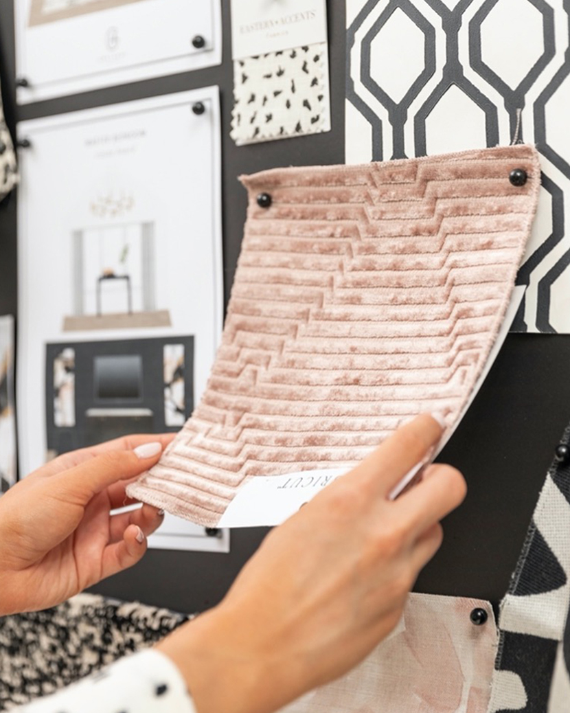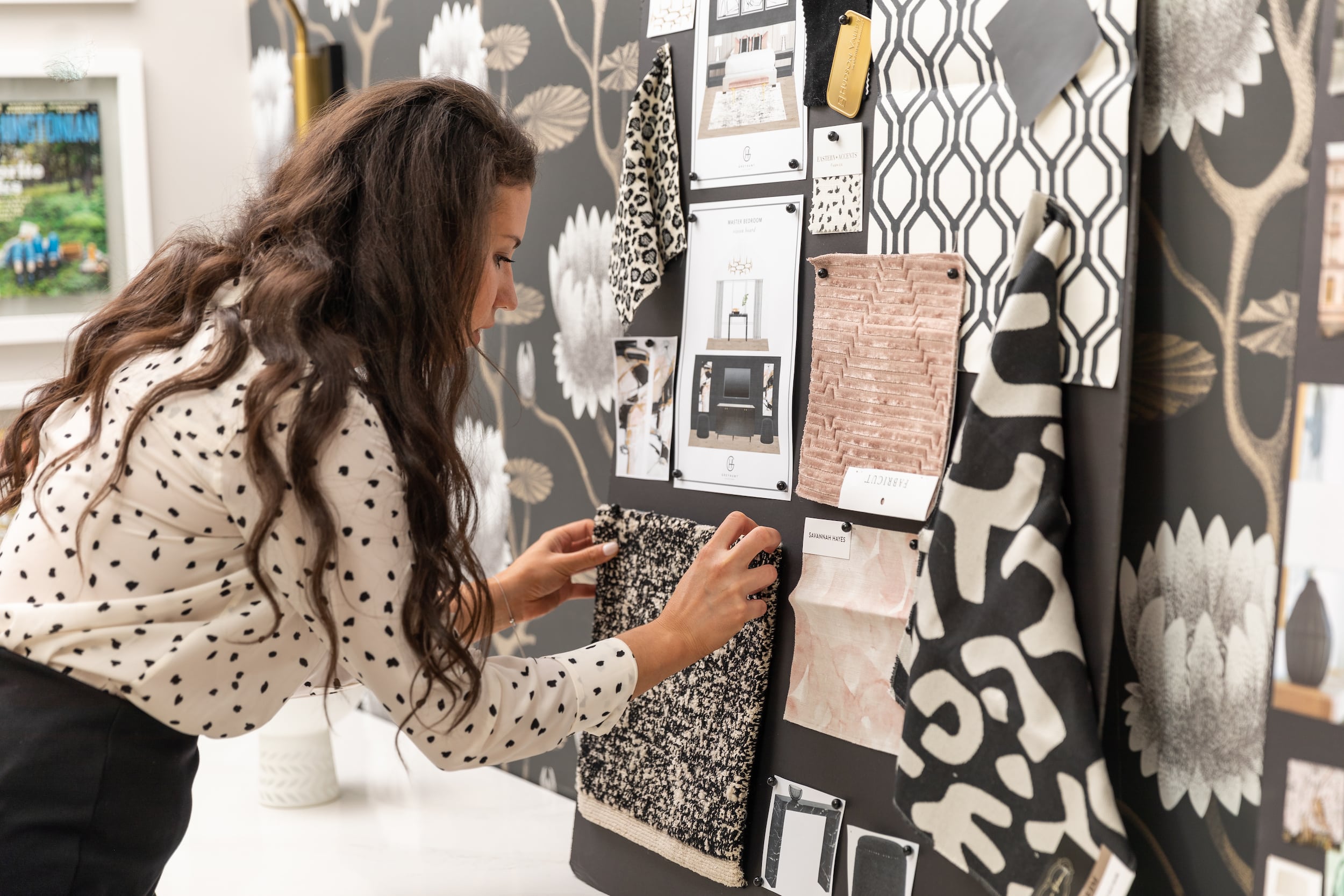
Sarah putting the finishing touches on our vision board.
We’ve been holding it in for so long, but we’re *finally* able to share more of our #IndyDesignDuo project with you guys…so let’s dive in! For those of you that don’t know, I married my best friend & talented husband, Judd, last May. We live in two different cities, and now that we’re married I wanted to make our Indiana house (formerly his bachelor pad) feel more like a space for a married couple. I think that every woman who has ever moved into a bachelor pad can agree that it needs a woman’s touch, so that’s exactly what I did. I started by picking a palette and creating a design that perfectly combined our two aesthetics. Then I teamed up with a few of my favorite brands - Universal Furniture, Hudson Valley Lighting, and Sherwin Williams (to name a few) to work on transforming this space.
Thanks to COVID, not only was our wedding shrunk-down to an intimate ceremony with just family, but our dream bedroom was also slowed to an almost standstill. Product delays and shipping issues aren’t just something clients deal with, we designers do too. But after months of waiting everything has finally arrived so we’ve begun to put the space together. Which means that very soon we can share the final product with you all! Yeah! This has been such a long time coming (over a year now), and has been a very hard secret to keep!
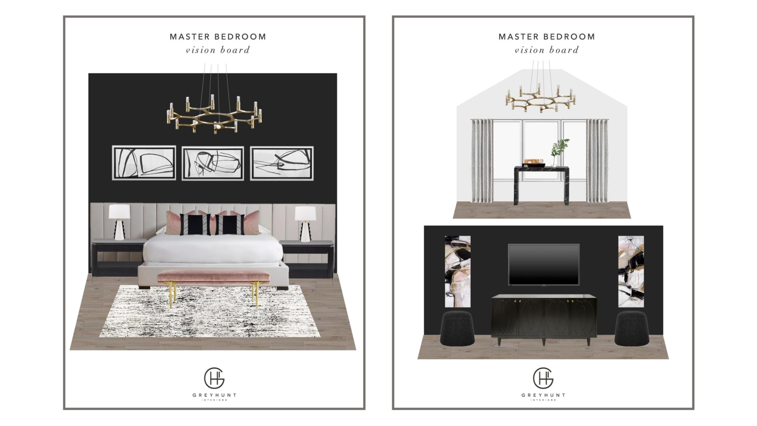
While the finishing touches are being put on the space, I wanted to go back and take you guys through some parts of the design process, so you can really see the transformation. Any designer can tell you that they’re one of their own worst clients. When it comes to our own homes we can be indecisive and a little scatter-brained, never giving it the same time & attention that we would for our clients. For this project, I wanted to design like I do for my clients so I methodically picked product, created a vision board, and sourced samples before I made any major decisions. Here’s the vision boards that we used to not only sell Judd on the design, but to also show our brand partners what we’d be creating in the end.
Once our brand partners (& Judd) were fully on-board, we got to transforming the space. The first thing to go was the hideous old popcorn ceiling (whoever put it in this home is no friend of mine). Once the space was popcorn-free we swapped out the purple-ish grey carpet for an engineered hardwood flooring, and added custom shades to all of the windows.
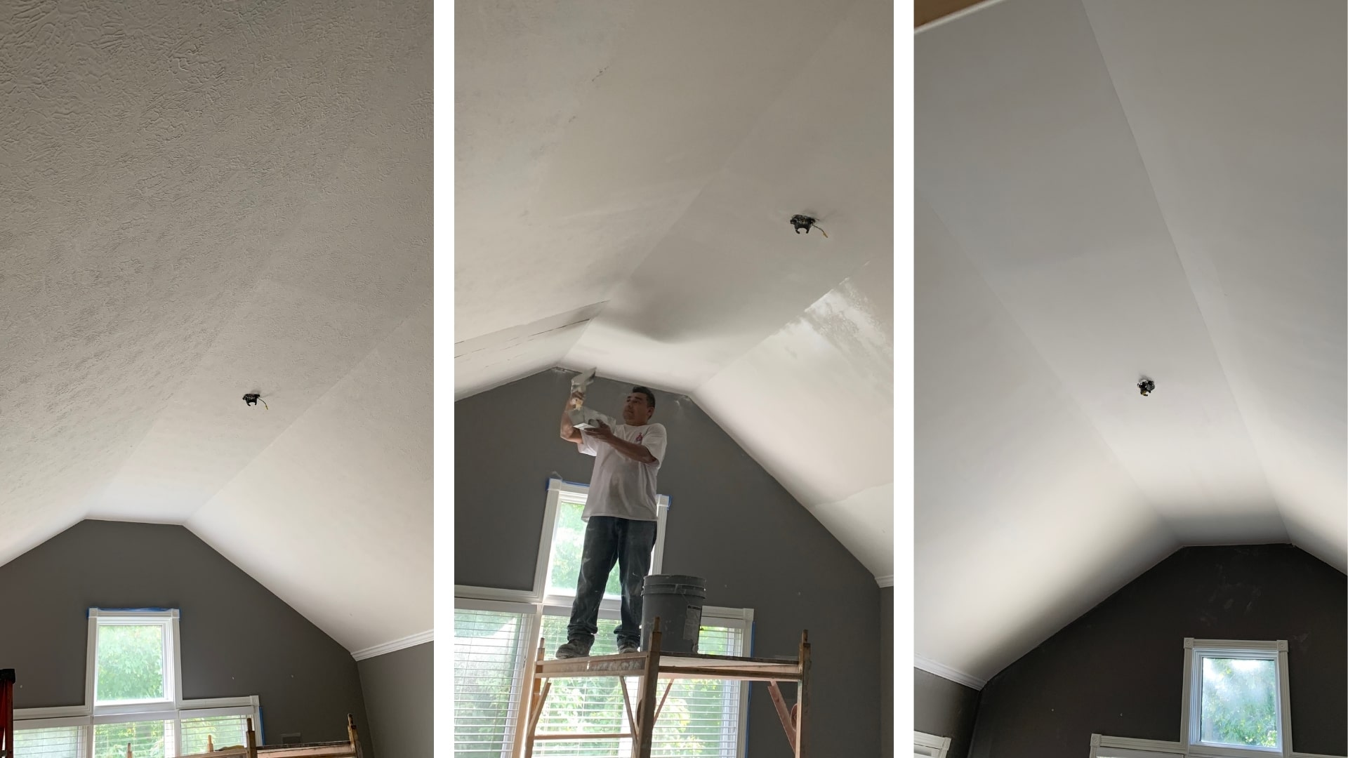
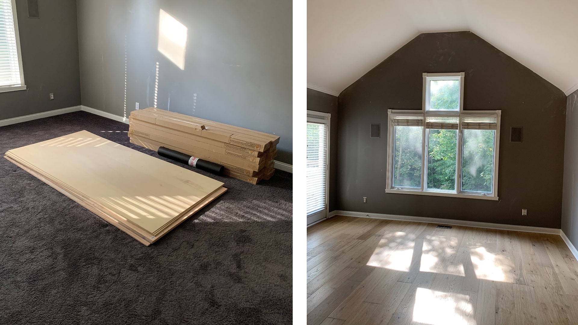
Removing the popcorn ceiling and adding the new flooring made all of the difference in the space.
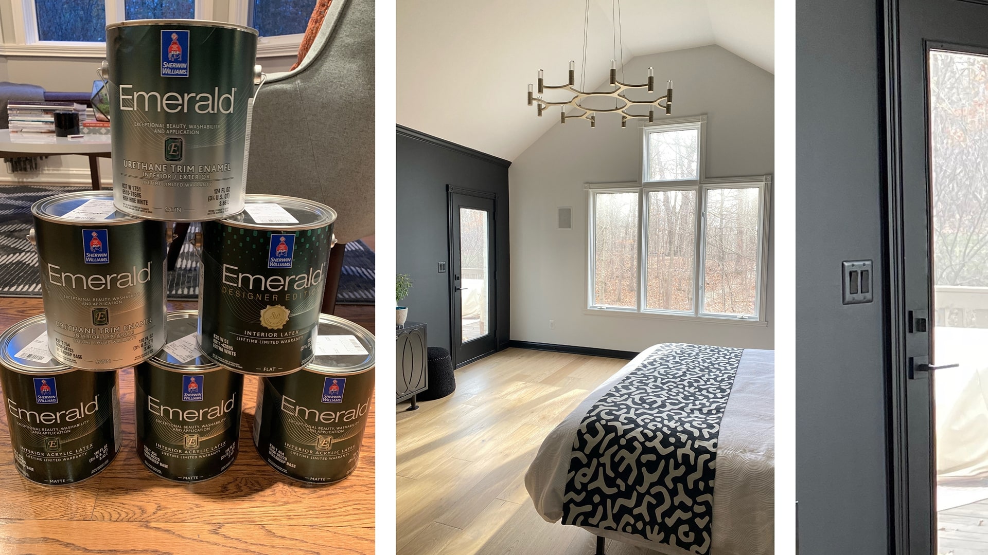
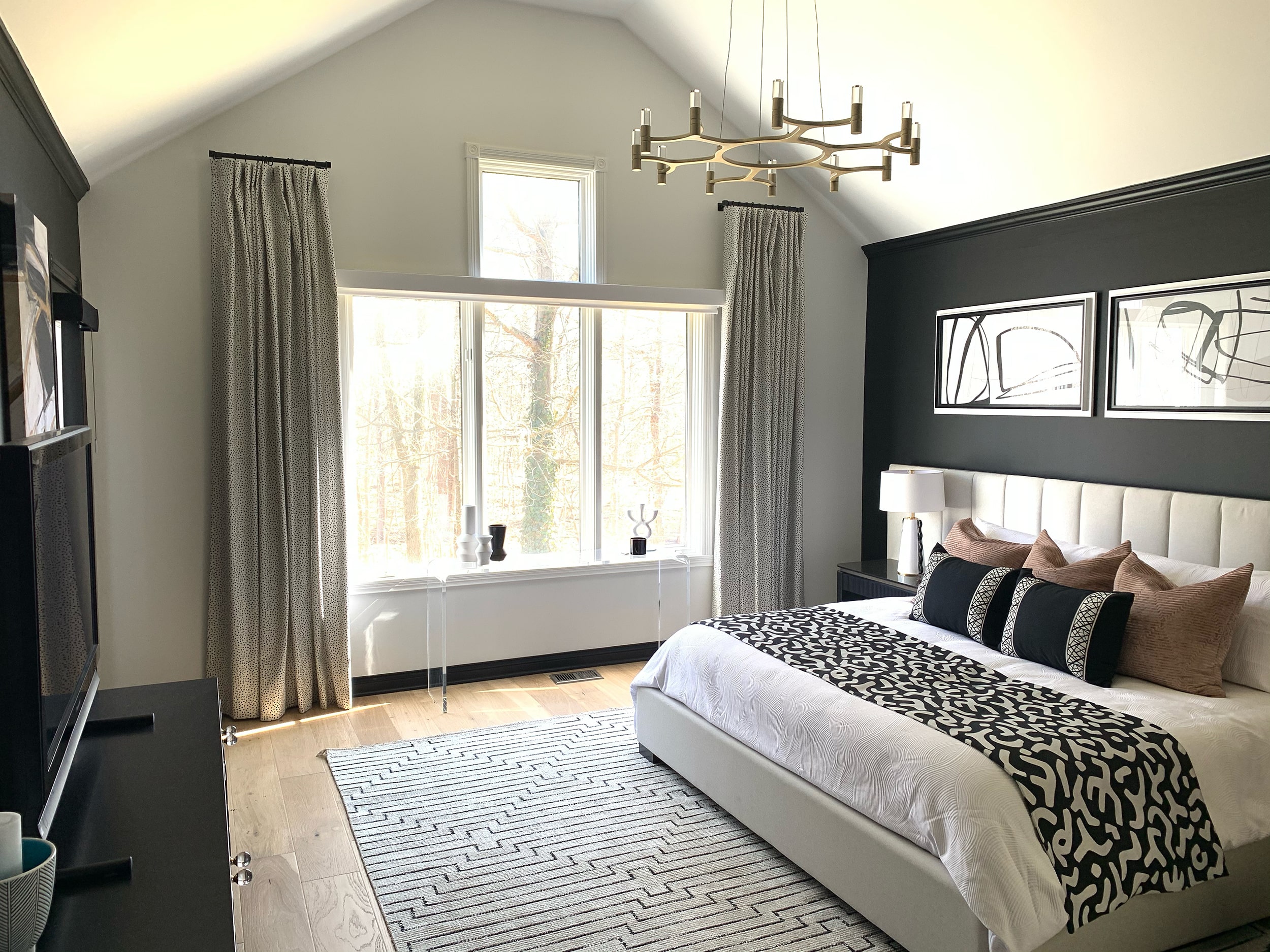
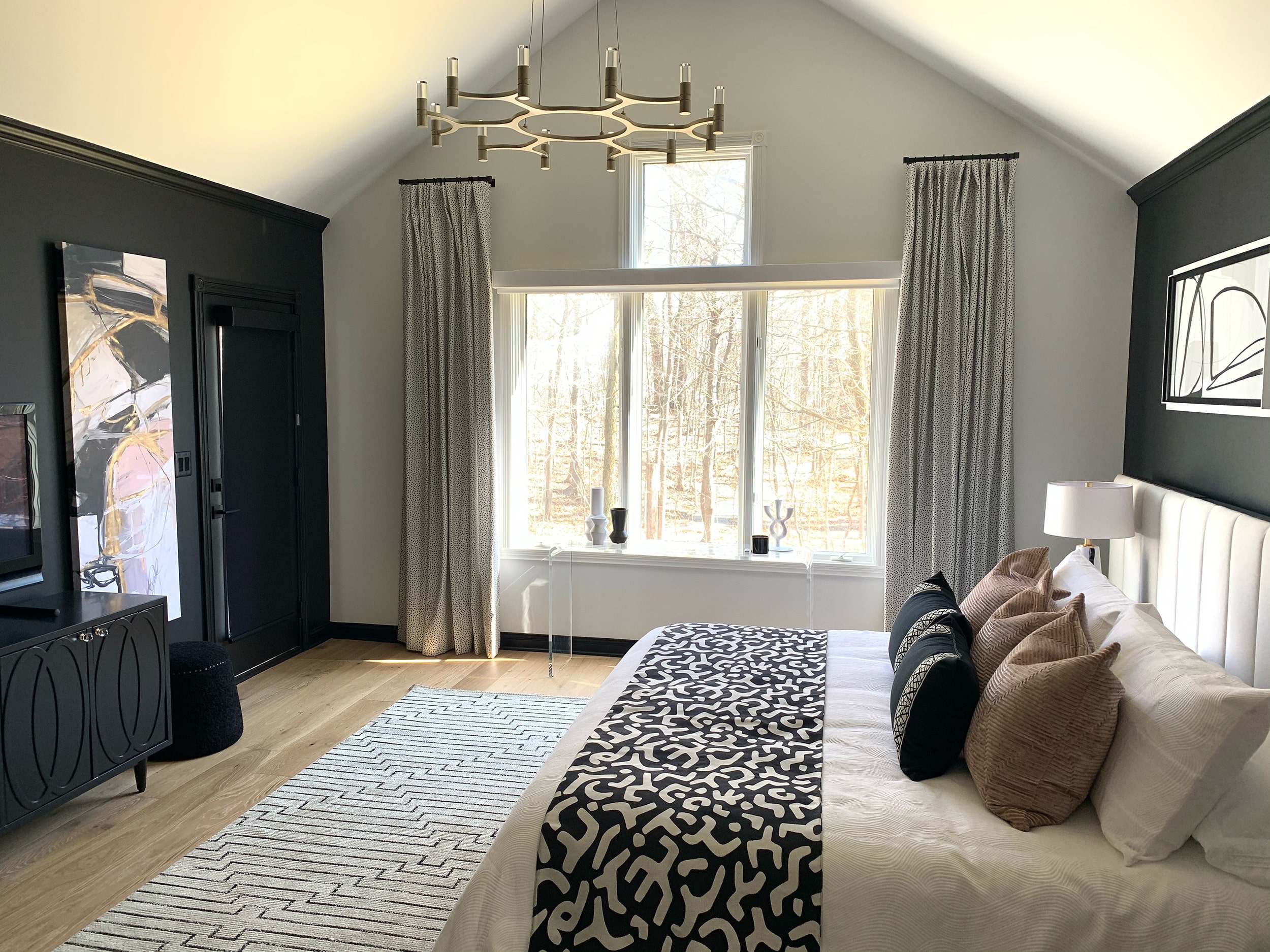
Once the new floors were in, it was time to paint. The entire space (including the trim, moldings, and ceiling) needed a fresh coat of paint. We ended up going with Sherwin Williams’ Emerald Designer Edition paints for this project, because of its superior performance & quality. I also wanted to give the space a more modern look, so we painted three of the walls and trim in a deep charcoal grey color- one of my go-tos. We went with Sherwin William’s Tricorn Black in matte for the walls, and satin for the trim to give it some contrast. We painted the remaining window wall and ceiling in Sherwin Williams Pure White in Flat, and trim in Satin to help the space feel lighter & brighter. This created a nice statement wall that you see right as you enter the room.
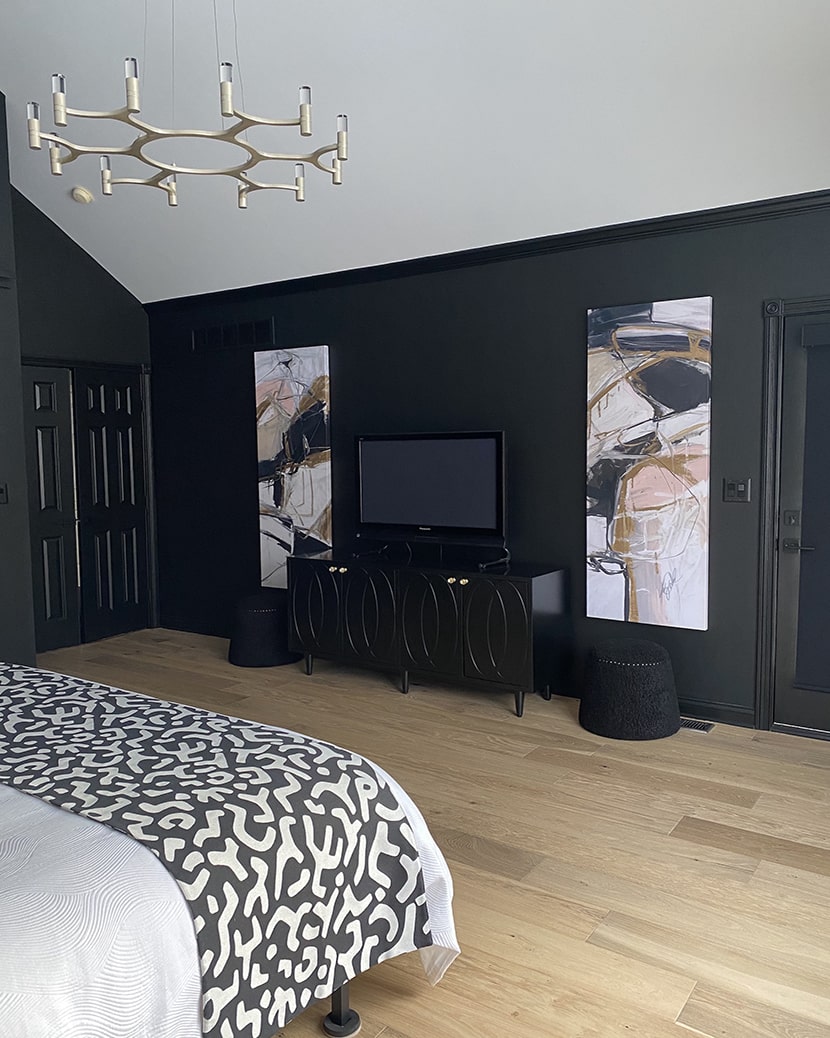
After the paint had dried, it was time to install some fresh new lighting. Our old dusty fan light just wasn’t going to cut it any longer, and had to go. I searched the internet high-and-low and absolutely fell in love with this chandelier from Hudson Valley Lighting. It’s called the Nexus Chandelier and is in the color Satin Silver Leaf. I love the material because it’s kind of an in-between metal that reads as silver in some lights and gold in others, making it perfect for our design. It also brought in a cool architectural element that draws your eye up and emphasizes the high vaulted ceilings.
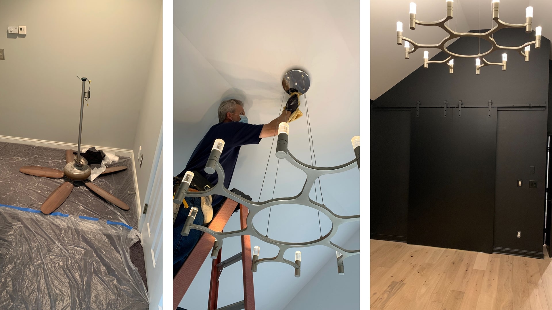
The new chandelier brings in lots of light and visual interest.Now that the lighting was in, floors were done, and paint was dry it was time to move in our new furniture (which I couldn’t be more thrilled about). We went with Universal Furniture’s Nina Magon collection for the headboard and nightstands. They’re modern pieces and help to bring in the clean lines that Judd loves (not to mention they’re pretty to look at). The headboard is the Universal Furniture Nina Magon – Magon King Wall Headboard. We chose this piece because of its generous size, so it works with the large scale of the room.
The nightstands are also from Universal Furniture, and they’re called the Nina Magon Iris Nightstand. I wanted something for our bedside tables that would not only be stylish, but also offer lots of storage. I think we can all admit that sometimes we fill our nightstands up with clutter, so having drawers to tuck things away keeps the space looking clean. I also loved that these offer a little bit of open storage for styling a few books or a pretty candle.
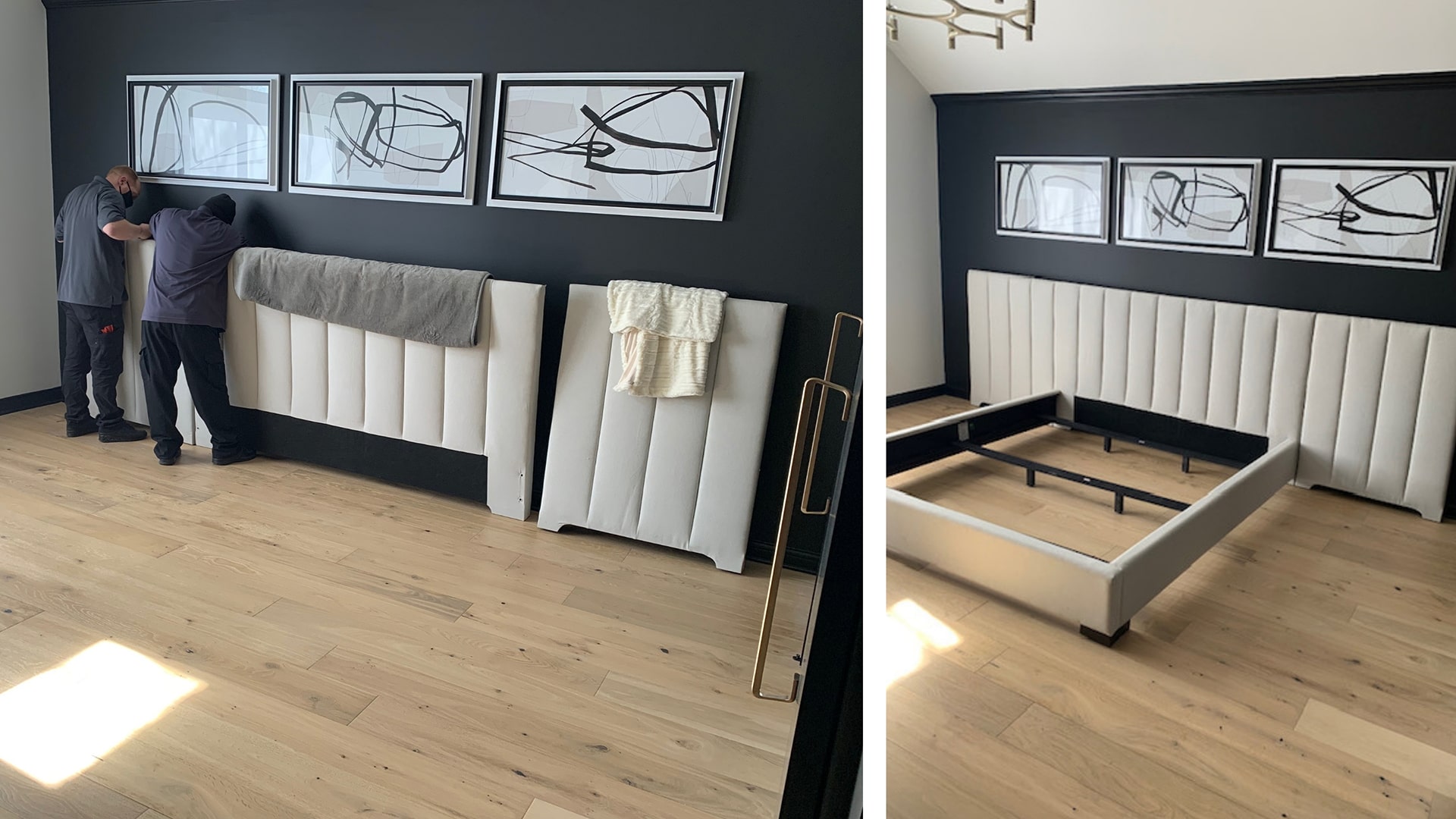
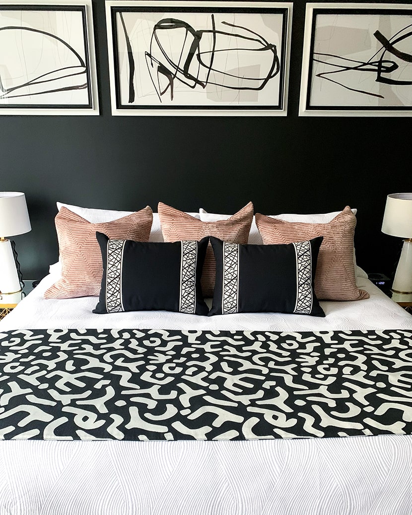
To fill the blank space above the bed I picked this chic 3-piece set of art from Uttermost. It’s called Jargon Wall Art, and is the perfect size to fill the space. Plus, I love how you can hang it in so many different orientations and arrangements since it’s totally abstract (check out their site to see what I mean). Another dead space that needed some TLC was the area around the TV console. To give it some life, I added these two colorful pieces of art from Leftbank Art above matching Gumdrop Ottomans from Uttermost flanking either side of this Worlds Away Mathais BLM console (currently sold out, but you can shop it in white here).
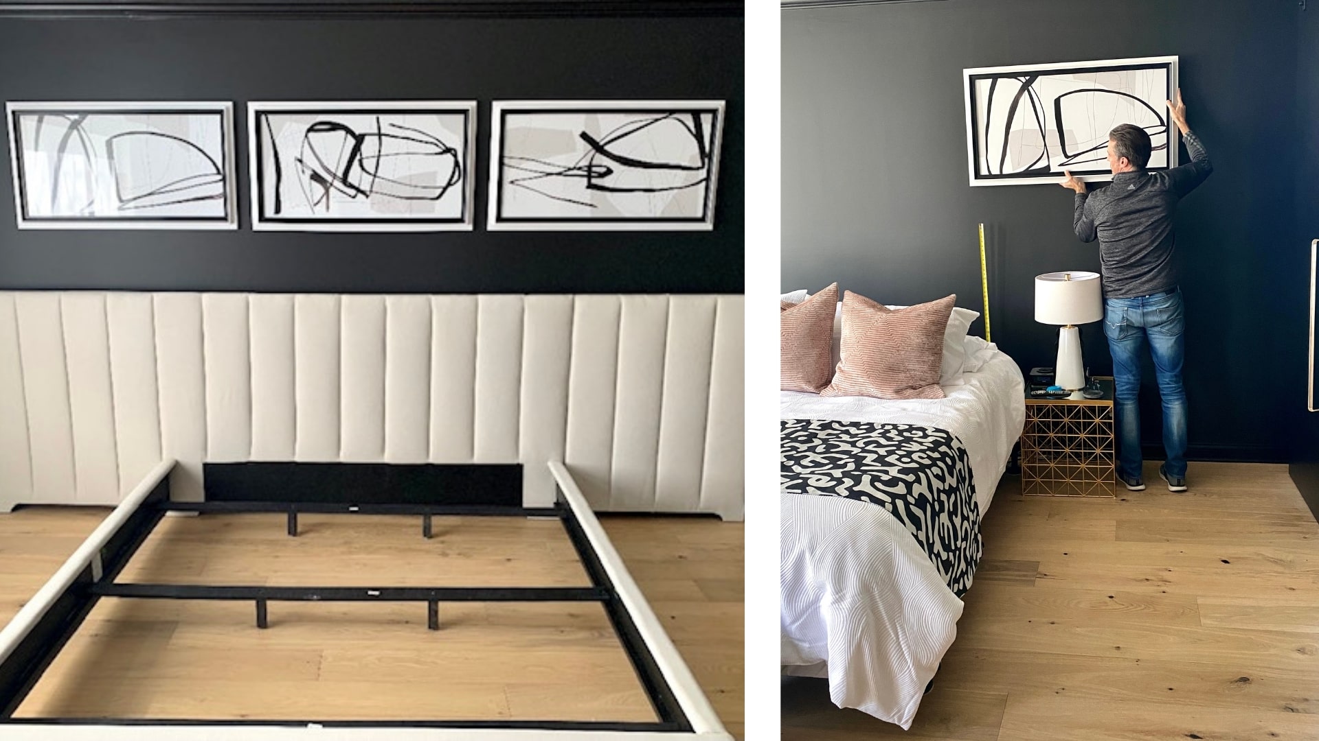
I had Judd hanging up this stunning art long before the furniture even arrived.
For bedding and accessories, I wanted to bring in some pops of pattern and color. For the end of the bed I used this Stroheim fabric to create a chic runner, as well as some Fabricut fabric to make these bold velvet pillows. To finish off the space I also added in these Eastern Accents Maddox Abstract Border Pillows and Camden Speckled Drapes to bring in some smaller scale prints.
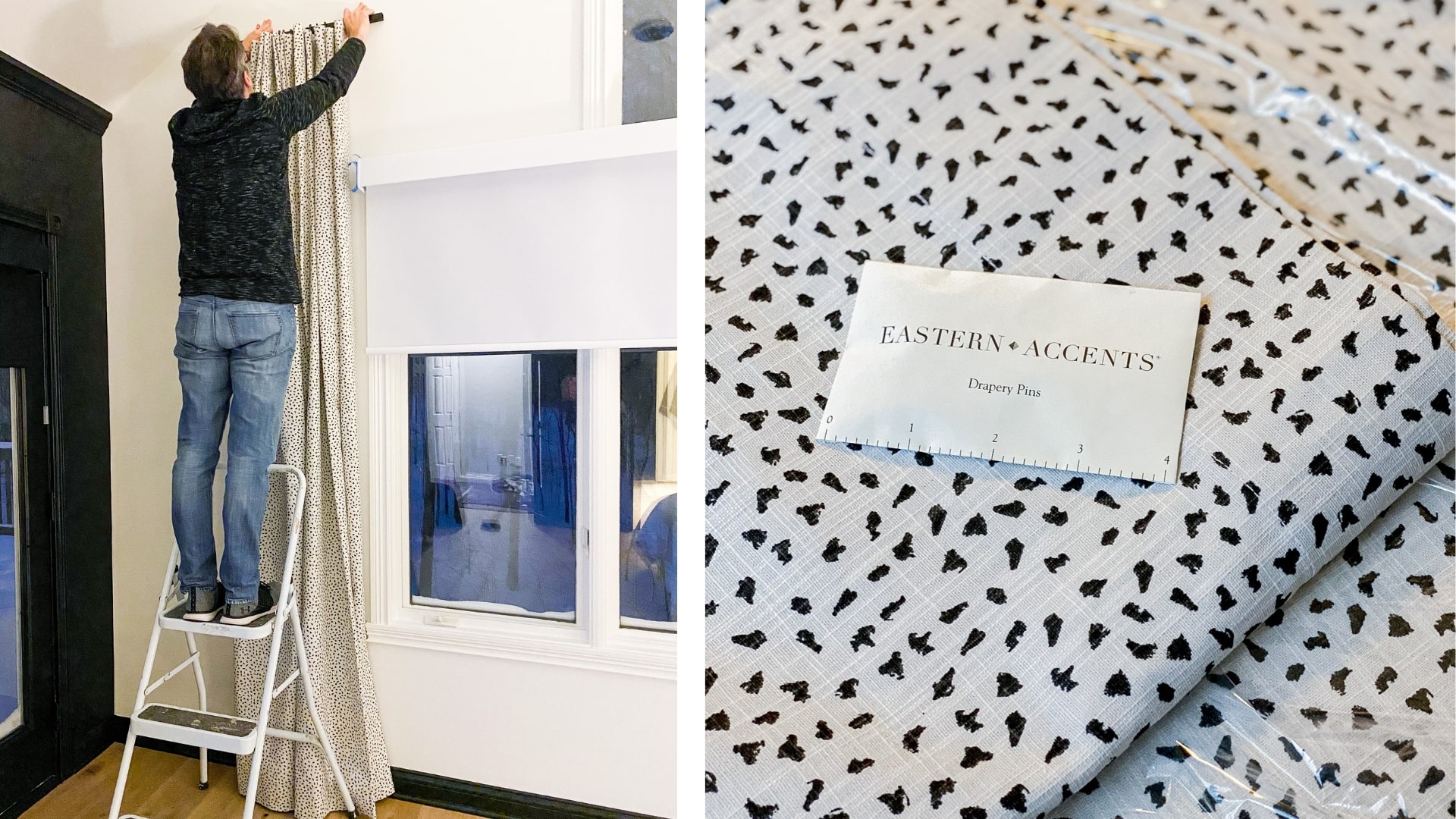
Judd is the best handy-man and did a great job hanging these drapes.Last, but certainly not least, we added this stunning rug from Jaipur Living. It’s helps to ground the space and create different defined areas within the room. Not to mention, it keeps the room warm on those chilly Indy mornings (no more cold feet!).
We can’t wait to share more of this project as we wrap it up, but until then I hope this quick update helped to keep you intrigued. We’ll share more soon!
Search Posts
Recent Posts
- Fun With Framing & Finds
- A Guide to Perfect Rug Sizing for Your Home
- Inside Palm Springs Modernism Week: A Designer’s Dream Journey Through Mid-Century Magic
- 2025’s Most Coveted Color Palettes: Your Guide to Next-Level Interior Design
- A Fresh Start: GreyHunt Interiors Is Growing With Purpose In 2025
- Transform Your Space: GreyHunt Interiors’ Guide to 2025 Design Trends
- High Point Market Fall 2024
- How to Plan For Your Next Interior Design Project
- GreyHunt Interiors Takes The Design World By Storm In 2024
- Hiring A Designer: Why Should You Do It?
Latest On Instagram
Contact Our Team

Sarah putting the finishing touches on our vision board.
We’ve been holding it in for so long, but we’re *finally* able to share more of our #IndyDesignDuo project with you guys…so let’s dive in! For those of you that don’t know, I married my best friend & talented husband, Judd, last May. We live in two different cities, and now that we’re married I wanted to make our Indiana house (formerly his bachelor pad) feel more like a space for a married couple. I think that every woman who has ever moved into a bachelor pad can agree that it needs a woman’s touch, so that’s exactly what I did. I started by picking a palette and creating a design that perfectly combined our two aesthetics. Then I teamed up with a few of my favorite brands - Universal Furniture, Hudson Valley Lighting, and Sherwin Williams (to name a few) to work on transforming this space.
Thanks to COVID, not only was our wedding shrunk-down to an intimate ceremony with just family, but our dream bedroom was also slowed to an almost standstill. Product delays and shipping issues aren’t just something clients deal with, we designers do too. But after months of waiting everything has finally arrived so we’ve begun to put the space together. Which means that very soon we can share the final product with you all! Yeah! This has been such a long time coming (over a year now), and has been a very hard secret to keep!
While the finishing touches are being put on the space, I wanted to go back and take you guys through some parts of the design process, so you can really see the transformation. Any designer can tell you that they’re one of their own worst clients. When it comes to our own homes we can be indecisive and a little scatter-brained, never giving it the same time & attention that we would for our clients. For this project, I wanted to design like I do for my clients so I methodically picked product, created a vision board, and sourced samples before I made any major decisions. Here’s the vision boards that we used to not only sell Judd on the design, but to also show our brand partners what we’d be creating in the end.

Once our brand partners (& Judd) were fully on-board, we got to transforming the space. The first thing to go was the hideous old popcorn ceiling (whoever put it in this home is no friend of mine). Once the space was popcorn-free we swapped out the purple-ish grey carpet for an engineered hardwood flooring, and added custom shades to all of the windows.


Removing the popcorn ceiling and adding the new flooring made all of the difference in the space.
Once the new floors were in, it was time to paint. The entire space (including the trim, moldings, and ceiling) needed a fresh coat of paint. We ended up going with Sherwin Williams’ Emerald Designer Edition paints for this project, because of its superior performance & quality. I also wanted to give the space a more modern look, so we painted three of the walls and trim in a deep charcoal grey color- one of my go-tos. We went with Sherwin William’s Tricorn Black in matte for the walls, and satin for the trim to give it some contrast. We painted the remaining window wall and ceiling in Sherwin Williams Pure White in Flat, and trim in Satin to help the space feel lighter & brighter. This created a nice statement wall that you see right as you enter the room.

After the paint had dried, it was time to install some fresh new lighting. Our old dusty fan light just wasn’t going to cut it any longer, and had to go. I searched the internet high-and-low and absolutely fell in love with this chandelier from Hudson Valley Lighting. It’s called the Nexus Chandelier and is in the color Satin Silver Leaf. I love the material because it’s kind of an in-between metal that reads as silver in some lights and gold in others, making it perfect for our design. It also brought in a cool architectural element that draws your eye up and emphasizes the high vaulted ceilings.

The new chandelier brings in lots of light and visual interest.Now that the lighting was in, floors were done, and paint was dry it was time to move in our new furniture (which I couldn’t be more thrilled about). We went with Universal Furniture’s Nina Magon collection for the headboard and nightstands. They’re modern pieces and help to bring in the clean lines that Judd loves (not to mention they’re pretty to look at). The headboard is the Universal Furniture Nina Magon – Magon King Wall Headboard. We chose this piece because of its generous size, so it works with the large scale of the room.
The nightstands are also from Universal Furniture, and they’re called the Nina Magon Iris Nightstand. I wanted something for our bedside tables that would not only be stylish, but also offer lots of storage. I think we can all admit that sometimes we fill our nightstands up with clutter, so having drawers to tuck things away keeps the space looking clean. I also loved that these offer a little bit of open storage for styling a few books or a pretty candle.

To fill the blank space above the bed I picked this chic 3-piece set of art from Uttermost. It’s called Jargon Wall Art, and is the perfect size to fill the space. Plus, I love how you can hang it in so many different orientations and arrangements since it’s totally abstract (check out their site to see what I mean). Another dead space that needed some TLC was the area around the TV console. To give it some life, I added these two colorful pieces of art from Leftbank Art above matching Gumdrop Ottomans from Uttermost flanking either side of this Worlds Away Mathais BLM console (currently sold out, but you can shop it in white here).

I had Judd hanging up this stunning art long before the furniture even arrived.

For bedding and accessories, I wanted to bring in some pops of pattern and color. For the end of the bed I used this Stroheim fabric to create a chic runner, as well as some Fabricut fabric to make these bold velvet pillows. To finish off the space I also added in these Eastern Accents Maddox Abstract Border Pillows and Camden Speckled Drapes to bring in some smaller scale prints.


Judd is the best handy-man and did a great job hanging these drapes.Last, but certainly not least, we added this stunning rug from Jaipur Living. It’s helps to ground the space and create different defined areas within the room. Not to mention, it keeps the room warm on those chilly Indy mornings (no more cold feet!).


We can’t wait to share more of this project as we wrap it up, but until then I hope this quick update helped to keep you intrigued. We’ll share more soon!
Search Posts
Recent Posts
- Fun With Framing & Finds
- A Guide to Perfect Rug Sizing for Your Home
- Inside Palm Springs Modernism Week: A Designer’s Dream Journey Through Mid-Century Magic
- 2025’s Most Coveted Color Palettes: Your Guide to Next-Level Interior Design
- A Fresh Start: GreyHunt Interiors Is Growing With Purpose In 2025
- Transform Your Space: GreyHunt Interiors’ Guide to 2025 Design Trends
- High Point Market Fall 2024
- How to Plan For Your Next Interior Design Project
- GreyHunt Interiors Takes The Design World By Storm In 2024
- Hiring A Designer: Why Should You Do It?

