
How could I not rave about colors during the season of colors everywhere? From the flowers outside to the natural beauty surrounding us, spring is full of creative design inspiration to make your space feel alive. To get the juices flowing, I’ve curated a list of some of my favorite designs that my team and I have made that take “pops” of color to the next level. From furniture, to wallpaper, to accent decor, get ready to go on a journey across the rainbow!
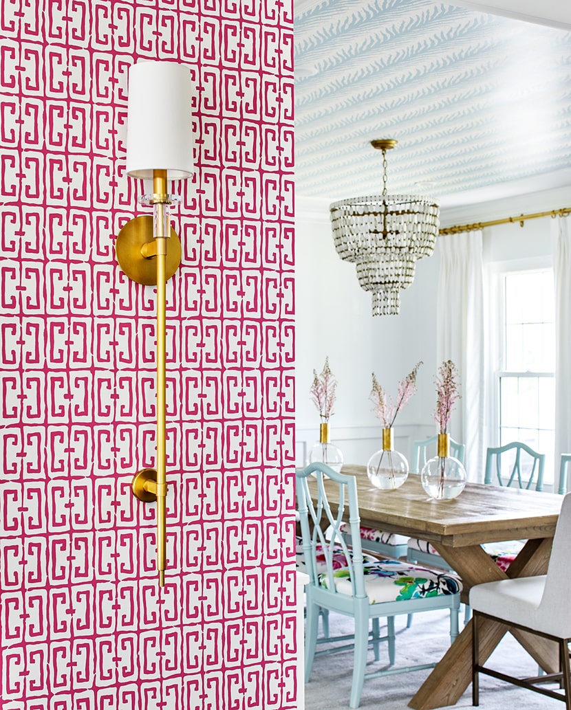
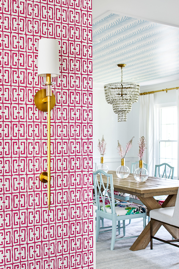
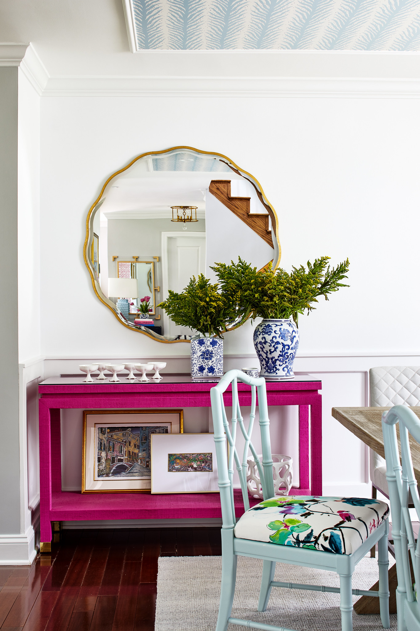
Pretty In Pink
Pink is full of femininity and playfulness. It exudes confidence in any space because of the happiness it makes us feel! I live for accent colored furniture. In the dining room of this rose colored home, I paired this gorgeous side table with the gold and blues around it. Haven’t you heard? Pink is not just a color, it's an attitude!
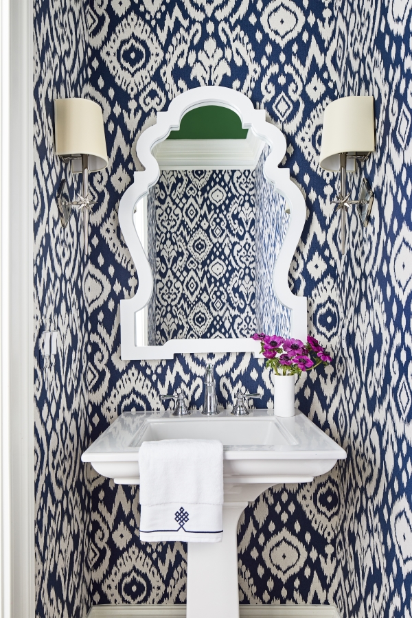
No Feeling Blue Here
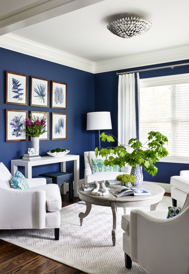
The color blue is perfect for feelings of calm, oasis, and relaxation. It can represent stability, wisdom, and serenity – all things we sure need in our lives.
Once in a blue moon (pun intended), there is a room that makes us feel so many feelings – and this is one of those times! These vibrantly blue walls are just stunning. We used this color in this cool space to give off class to pair with those neutral pieces of furniture.
Here Comes The Sun
What could be more regal and confident than mustard yellow? This is the perfect color to pair as an accent, or use as the start in a room full of relaxation.
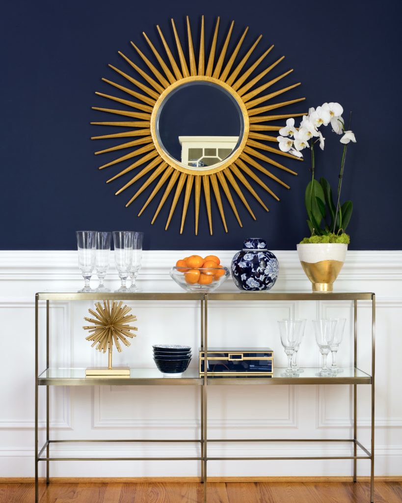
I love this vibrant use of mustard because of the way it just calls your attention to it. I can’t stop staring at that sunburst mirror! How beautiful?
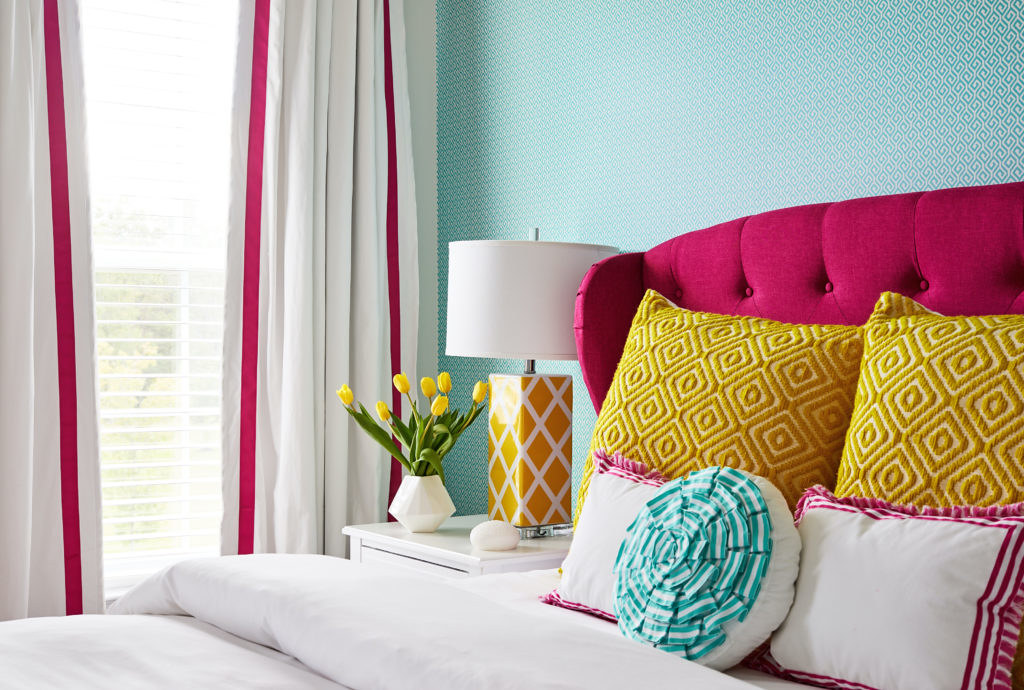
Now this! This is a bed I’d love to be in. The combo of pink and mustard is just to die for! I can just imagine cozying up in this bed fit for a queen.
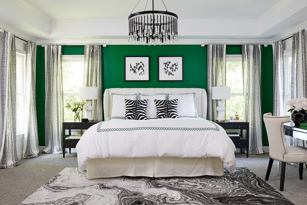
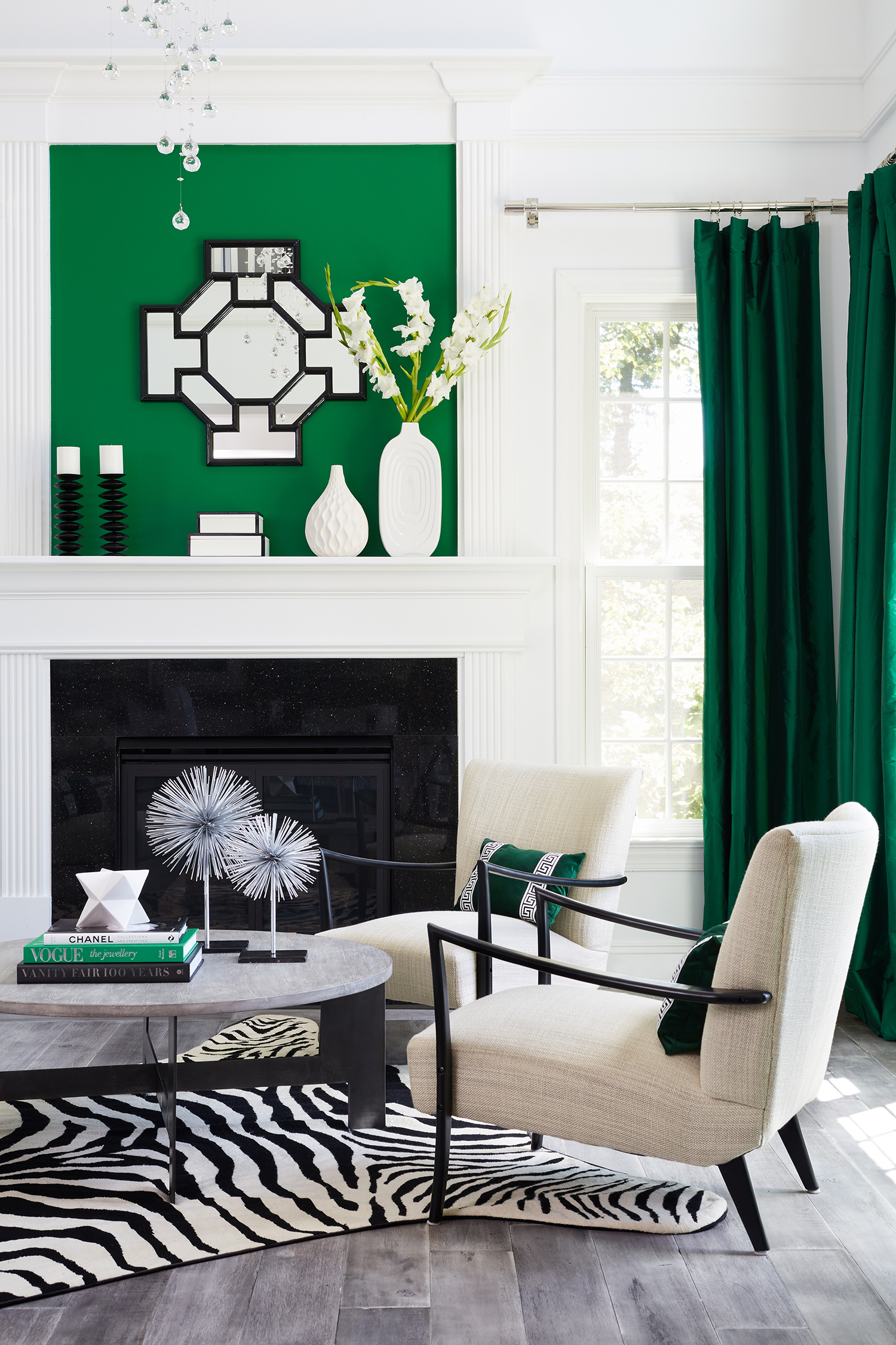
Green Is The New Gold
Take us to see the wizard! Emerald green keeps it fresh and fun, while also representing wealth and purity. This is one of my all time favorite bedroom redesigns. That green statement wall is just captivating and demands to be seen! How would you feel with this master?
From the same home, we were clearly not green with envy here; More like green with generosity because of how much we use it! Every single element of this living space gives thanks to the beautiful color.
Beautiful Chartreuse Accents
Chartreuse represents enthusiasm, happiness, nature, growth, and youth. Like standard green, it gives off the liveliness and blossoming of spring. It also gives off calming vibes that can support any space in a wonderful way!
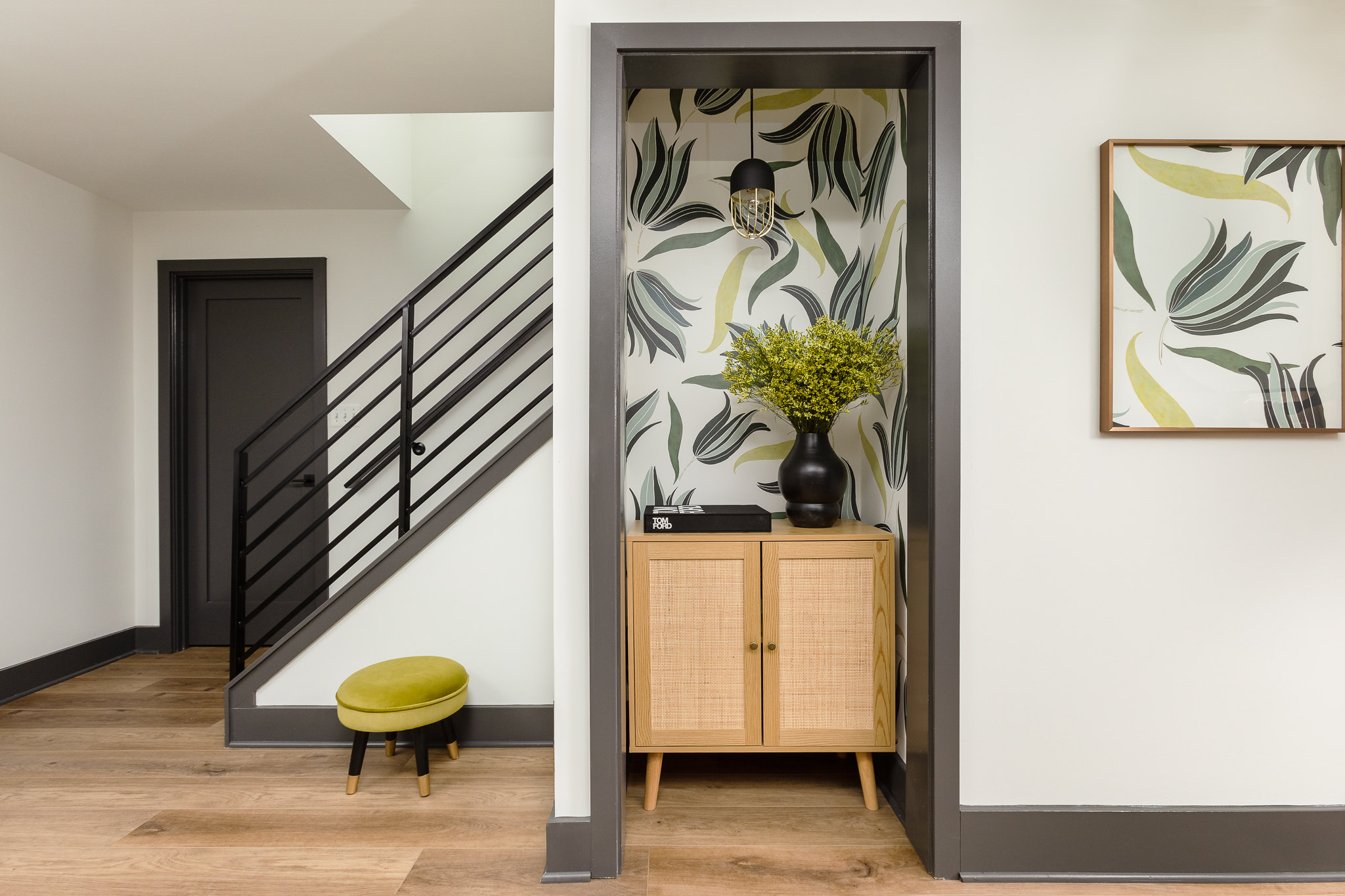
Loving the use of patterns here! Its funkiness is rich and entertaining, and could not be better expressed in any other color but chartreuse. I love the way this corridor is made into its own space with personality.
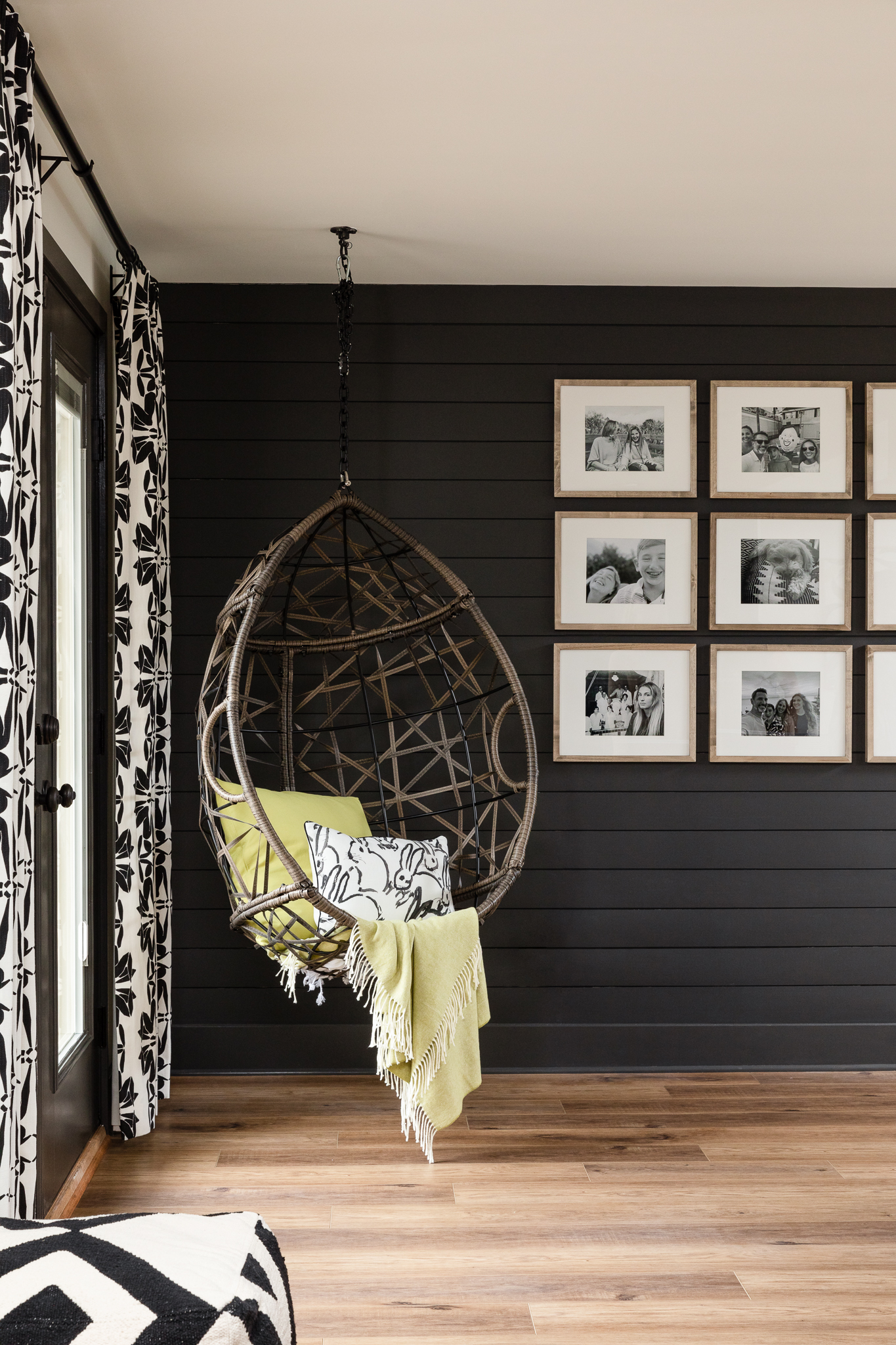
This corner space is perfectly accented with this gorgeous blanket. Highlight your neutrals with accent colors, like this chartreuse, to have some fun with it!
That’s all for now! Are you ready to use these tips as your begin your own spring redesigns? And how about adding your own pops of color for some fun?
As always, stay tuned for more tips and tricks coming your way.
XOXO,Sallie
Search Posts
Recent Posts
- GreyHunt Interiors Takes The Design World By Storm In 2024
- Hiring A Designer: Why Should You Do It?
- Taking The Old & Making It New Again
- Transform Your Bathroom: Renovation Inspiration
- My Kitchen Renovation Journey: What I Learned as a Designer Renovating My Own Home
- Summer Styling Tips From Sallie Lord of GreyHunt Interiors
- GreyHunt’s New Indiana Home Anniversary
- Designing the GreyHunt Interiors Show Room for the 2024 Decorators’ Show House
- Indy’s Interior Icons: A Peek Inside the Circle City’s Coolest Spaces
- Hidden Gems of Indianapolis: A Staycation To Remember At Bottleworks Hotel
Latest On Instagram

Contact Our Team
How could I not rave about colors during the season of colors everywhere? From the flowers outside to the natural beauty surrounding us, spring is full of creative design inspiration to make your space feel alive. To get the juices flowing, I’ve curated a list of some of my favorite designs that my team and I have made that take “pops” of color to the next level. From furniture, to wallpaper, to accent decor, get ready to go on a journey across the rainbow!
Pretty In Pink
Pink is full of femininity and playfulness. It exudes confidence in any space because of the happiness it makes us feel! I live for accent colored furniture. In the dining room of this rose colored home, I paired this gorgeous side table with the gold and blues around it. Haven’t you heard? Pink is not just a color, it's an attitude!
No Feeling Blue Here
The color blue is perfect for feelings of calm, oasis, and relaxation. It can represent stability, wisdom, and serenity – all things we sure need in our lives.
Once in a blue moon (pun intended), there is a room that makes us feel so many feelings – and this is one of those times! These vibrantly blue walls are just stunning. We used this color in this cool space to give off class to pair with those neutral pieces of furniture.
Here Comes The Sun
What could be more regal and confident than mustard yellow? This is the perfect color to pair as an accent, or use as the start in a room full of relaxation.
I love this vibrant use of mustard because of the way it just calls your attention to it. I can’t stop staring at that sunburst mirror! How beautiful?
Now this! This is a bed I’d love to be in. The combo of pink and mustard is just to die for! I can just imagine cozying up in this bed fit for a queen.
Green Is The New Gold
Take us to see the wizard! Emerald green keeps it fresh and fun, while also representing wealth and purity. This is one of my all time favorite bedroom redesigns. That green statement wall is just captivating and demands to be seen! How would you feel with this master?
From the same home, we were clearly not green with envy here; More like green with generosity because of how much we use it! Every single element of this living space gives thanks to the beautiful color.
Beautiful Chartreuse Accents
Chartreuse represents enthusiasm, happiness, nature, growth, and youth. Like standard green, it gives off the liveliness and blossoming of spring. It also gives off calming vibes that can support any space in a wonderful way!
Loving the use of patterns here! Its funkiness is rich and entertaining, and could not be better expressed in any other color but chartreuse. I love the way this corridor is made into its own space with personality.
This corner space is perfectly accented with this gorgeous blanket. Highlight your neutrals with accent colors, like this chartreuse, to have some fun with it!
That’s all for now! Are you ready to use these tips as your begin your own spring redesigns? And how about adding your own pops of color for some fun?
As always, stay tuned for more tips and tricks coming your way.
XOXO,Sallie
Search Posts
Recent Posts
- GreyHunt Interiors Takes The Design World By Storm In 2024
- Hiring A Designer: Why Should You Do It?
- Taking The Old & Making It New Again
- Transform Your Bathroom: Renovation Inspiration
- My Kitchen Renovation Journey: What I Learned as a Designer Renovating My Own Home
- Summer Styling Tips From Sallie Lord of GreyHunt Interiors
- GreyHunt’s New Indiana Home Anniversary
- Designing the GreyHunt Interiors Show Room for the 2024 Decorators’ Show House
- Indy’s Interior Icons: A Peek Inside the Circle City’s Coolest Spaces
- Hidden Gems of Indianapolis: A Staycation To Remember At Bottleworks Hotel